BI
The logo of KOREEL shows the direction of the brand to provide the best innovative products in a timely manner.
KOREEL's brand logo
As a representative visual that symbolizes KOREEL, it is a core basic element of C.I.S (Corporate Identity).
The brand logo serves to convey a sense of unity among all members of KOREEL internally and a consistent image externally.
Typeface with dynamism and precision is an expression of KOREEL's strong will to supply the world's best innovative products in a timely manner.
Based on KOREEL's unique identity, the original Typeface expresses confidence in corporate management externally, and internally creates solidarity and pride.
By designing the letter 'O' in the shape of a reel, it represents the second leap as a world-centered reel producer.

KOREEL Brand Logo Drawing Law and Regulations
The brand logo should not be arbitrarily deformed or distorted because its size and proportion are small by the accurate grid system.
When using the brand logo, the output method must be based on computer data in principle, but if it is impossible to use the manuscript using computer data due to the size of the logo or the specificity of the production method, the following proportions accurately drawn by the gird system shall be followed.


KOREEL brand logo color regulation
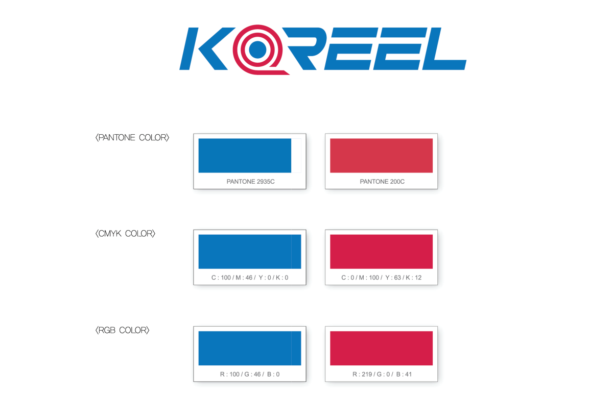
The exclusive color is an important factor in forming the identity of KOREEL. For the expression of exclusive colors, spot color printing is the principle, and the Panton Color specified below is the basis.
If spot color printing is not possible due to the characteristics of the medium, CMYK or RGB color should be applied to reproduce it.
